A commentary on the difference between v0 and v1
Overview
Kintone UI Component v1 has been reviewed to make it easier for developers to create Kintone style components.
This section explains the differences between the code written in v0 and v1, as well as the key advantages when using v1 for customizing the Kintone app.
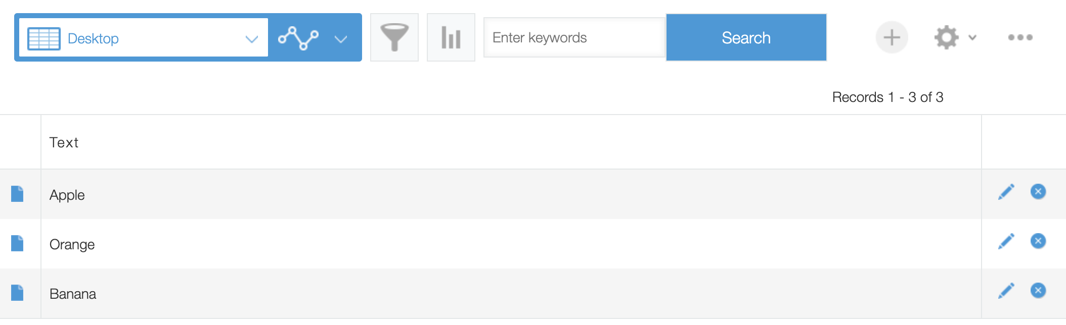
Completed image
For example, you can use the Kintone UI Component to create a search button on the Record List page.
Here is the image for example:
JavaScript and CSS Customization
Let's start by looking at the code.
The Kintone UI Component UMD file is used here.
You can see how to upload a file in the Quick Start.
When v0 is used
// Process to prevent component duplication bug
if (document.getElementById('my_index_text') !== null) {
  return event;
}

const header = kintone.app.getHeaderMenuSpaceElement();

// Show search box
const text = new kintoneUIComponent.Text({
  placeholder: 'Enter keywords'
});

const button = new kintoneUIComponent.Button({
  type: 'submit',
  text: 'Search'
});

// Use text and a button side by side
text.element.style.float = 'left';
button.element.style.float = 'right';

header.appendChild(text.render());
header.appendChild(button.render());

// Specified id for component duplication bug prevention
text.element.id = 'my_index_text';
When v1 is used
// Process to prevent component duplication bug
if (document.getElementById('kuc_text') !== null) {
  return event;
}

const header = kintone.app.getHeaderMenuSpaceElement();

// Show search box
const text = new Kuc.Text({
  placeholder: 'Enter keywords',
  id: 'kuc_text'
});

const button = new Kuc.Button({
  type: 'submit',
  text: 'Search',
  id: 'kuc_button'
});

header.appendChild(text);
header.appendChild(button);
The difference between v0 and v1
So what has changed between v0 and v1 in terms of coding?
The main difference is as follows:
- Naming space is simplified
- render() method is no longer required
- Property can now be used to update values
- Improved DOM positioning
- Restructured the component property
- Included additional properties for Alert and Label
- Auto-completion of Item.label
The following section will explain in further detail.
Naming Space is simplified
In v1, you can call the instance from new kintoneUIComponent to new Kuc in order to write a concise code.
- v0 Code
const text = new kintoneUIComponent.Text({
  placeholder: 'Enter keywords'
});
- v1 Code
const text = new Kuc.Text({
  placeholder: 'Enter keywords'
});
In addition, there is no risk that one of them will be overwritten when both v0 and v1 UMD are loaded in the same app.
render() method is no longer required
In v0, the element of the component must be returned by using the render() method along with appendChild() for internal implementation reasons.
In v1, render() is no longer required, and the components can be displayed easier.
- v0 Code
header.appendChild(text.render());
- v1 Code
header.appendChild(text);
Property can now be used to update values
In v0, when a value is updated, a method must be called separately.
In v1, you can use properties to update values.
- v0 Code
const button = new kintoneUIComponent.Button({
  type: 'submit',
  text: 'Search'
});

// Update the value by calling the method
button.setText('Register');
- v1 Code
const button = new Kuc.Button({
  type: 'submit',
  text: 'Search',
  id: 'kuc_button'
});

// Property can be used to update values
button.text = 'Register';
Improved DOM positioning
In v0, the specifications of each part are lined up vertically by default, and CSS is required to be adjusted in the same order.
- style must be adjusted
// Use text and button side by side
text.element.style.float = 'left';
button.element.style.float = 'right';
In v1, the internal specifications are being restructured, and most of the components are side by side by default, so no additional adjustment is required.
(For some components, the default value is set to vertical for convenience.)
Restructured the component property
In v1, the properties of each component have been reviewed and updated.
For example, you can add an id to the component by using id property that is newly added in v1.
You can then use the id to retrieve the element.
- v0 Code
// Process to prevent component duplication bug
if (document.getElementById('my_index_text') !== null) {
  return event;
}

const text = new kintoneUIComponent.Text({
  placeholder: 'Enter keywords'
});

// ID property is missing, ID must be granted separately
text.element.id = 'my_index_text';
- v1 Code
// Process to prevent component duplication bug (ID name granted by the property is available)
if (document.getElementById('kuc_text') !== null) {
  return event;
}

const header = kintone.app.getHeaderMenuSpaceElement();
const text = new Kuc.Text({
  placeholder: 'Enter keywords',
  id: 'kuc_text'
});
Included additional properties for Alert and Label
In v0, when you want to display an error message in a component, or when you want to display a label, you need to implement it in another component such as Alert or Label.
In v1, you can assign values to the error and the label property in a component.
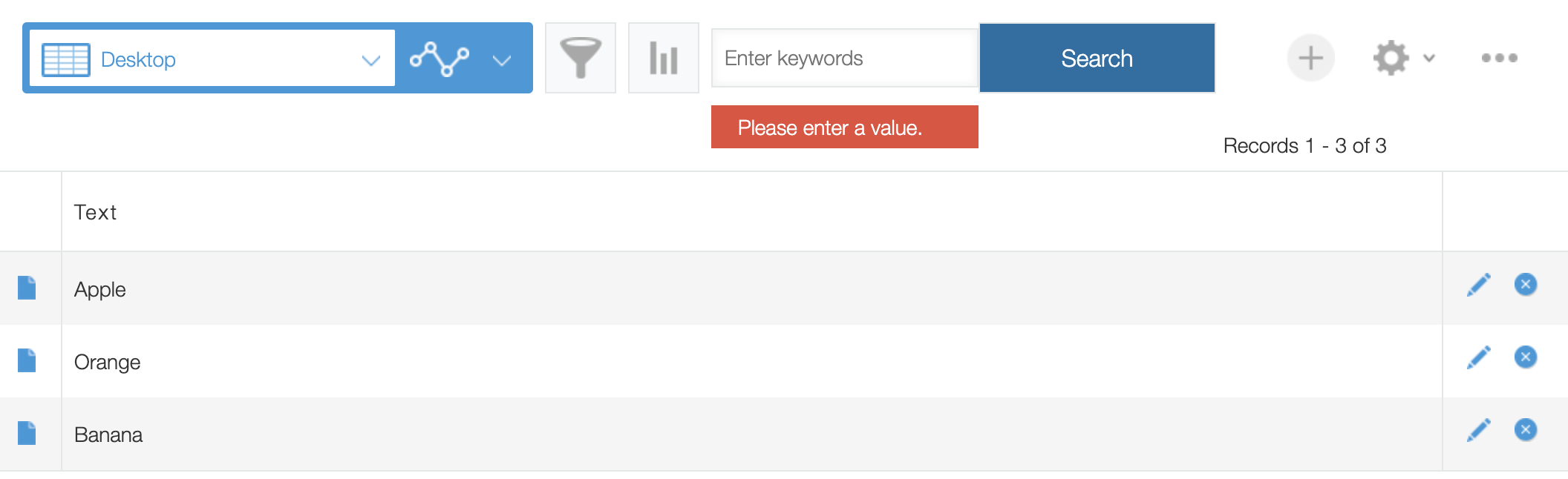
Let's take a look at the Text component error property for example:
In the beginning, I have introduced a code to use KUC to create the search box, but there is no response when you click the button.
After adding additional handler, when the button is clicked, the text input value is checked and the error message is displayed only when there is no value.
Here is a sample code.
const button = new Kuc.Button({
  type: 'submit',
  text: 'Search',
  id: 'kuc_button'
});

/* Add the following code */

// Add the process of click event to the displayed button
button.addEventListener('click', event => {
  const keyword = text.value;
  const errorMessage = 'Please enter a value.';
  // Hide the error message
  text.error = '';

  // Check if there is a value
  if (!keyword) {
    // Show the error message
    text.error = errorMessage;
    return;
  }
});
In the above code, inside the click event, the value is retrieved from text.value, and is checked using regular expressions.
If the result of the check is not a full-width, the error message is displayed and the process is interrupted.
The error property is used to display the error message.
When you initialize the message (hide the error message), you will only need to assign an empty string to text.error property.
Auto-completion of Item.label
When creating multiple choice components in v0, the developer had to specify both Item.label and Item.value.
However, when using v1, only Item.value is required. If Item.label is not specified, only the value of Item.value will be set.
This means that the coding will be more concise when the backend value and the label displayed in the UI are the same.
You can abbreviate the coding as follows:
const checkbox = new Kuc.Checkbox({
  items: [
    {
      value: 'orange'
    }
  ]
});
Conclusion
How is it working out for you?
We hope you will experience a better Kintone development than ever before using the new Kintone UI Component library.
This article was reviewed by Kintone and Google Chrome as of February, 2021.
In addition, the version of Kintone UI Component that is used for customizations is v0.7.4 and v1.0.0.
The documentation for v0 is a separate site.Please check here.