Format setting plug-in
Overview
By using Kintone UI Component, the user can expand the range of utilization not only on the Kintone app page but also on the plug-in settings page.
This article explains how to use Kintone UI Component on the plug-in settings page.
The creation of a simple Conditional Format Plug-in is used as an example.
Components to use
Completed image
The implementation scenarios and the completed image of the customized page are as follows:
Set the account closing date of your company on the plug-in settings page and implement a customization as a plug-in that colors red the target field of a record when today's date is before the closing date.
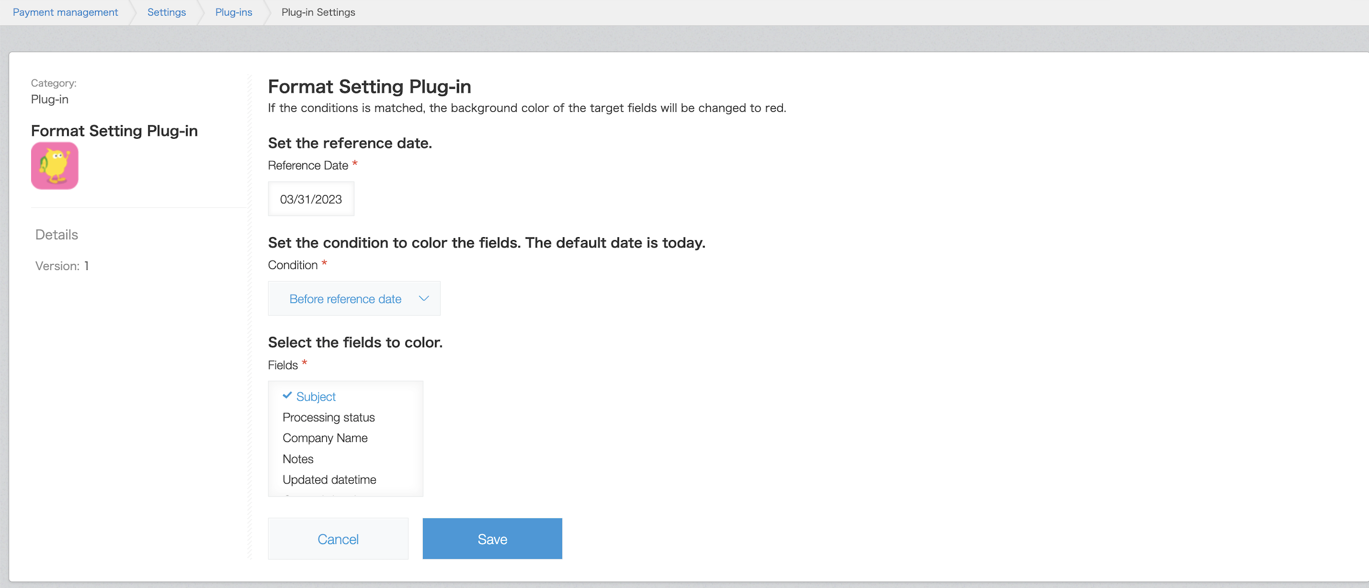 This is the plug-in settings page.
When the set conditions match (if today's date is before or after the reference date), the color of the set field changes to red on the Record Details page.
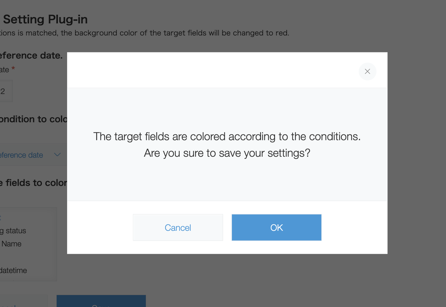 A confirmation dialog is displayed when saving the settings.
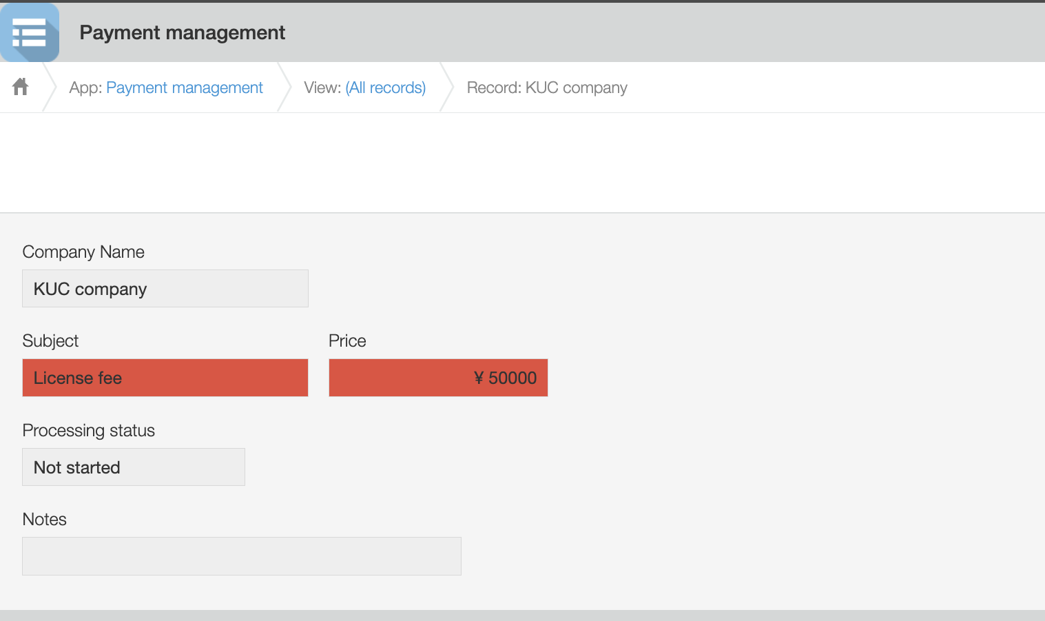 This is an app that manages deposits.
The background color of the field changes according to the conditions set on the plug-in settings page.
What you will need to have ready
Prepare the files with the following folder structure in creating this Kintone plug-in.
The folder structure and file names are examples.
src/
├── image/
|   ├── icon.png
├── js/
|   ├── config.js
|   ├── desktop.js
├── css/
|   ├── config.css
├── html/
|   ├── config.html
├── lib/
|   ├── luxon.js
|   ├── kuc.min.js
|
├── manifest.json
Create a manifest file
Create a manifest file like the one below.
{
  "manifest_version": 1,
  "version": 1,
  "type": "APP",
  "name": {
    "en": "Format Setting Plug-in"
  },
  "description": {
    "en": "This is a sample plug-in."
  },
  "icon": "image/icon.png",
  "desktop": {
    "js": [
      "js/desktop.js",
      "lib/luxon.js"
    ],
    "css": []
  },
  "config": {
    "html": "html/config.html",
    "js": [
      "lib/kuc.min.js",
      "js/config.js"
    ],
    "css": [
      "css/config.css"
    ],
    "required_params": ["date", "condition", "targetFields"]
  }
}
Kintone UI Component will be used for this customization on the plug-in settings page, so describe the path of the UMD file in the config object.
See Quick Start for how to upload a UMD file.
Create a plug-in icon
Create a plug-in icon following the guide.
Place the icon file (icon.png) in the image folder.
HTML customization
Create an HTML file for the plug-in settings page.
Create a file like the one below. Place each part of Kintone UI Component by using the id set in the div element.
<section class="settings">
  <h2 class="settings-heading">Format Setting Plug-in</h2>
  <p>If the conditions match, the background color of the target fields will be changed to red.</p>
  <br/>
    <h3 class="kintoneplugin-desc">Set the reference date.</h3>
    <p class="kintoneplugin-row">
      <div id="date_space"></div>
    </p>
    <br/>
    <h3 class="kintoneplugin-desc">Set the condition to color the fields. The default date is today.</h3>
    <p class="kintoneplugin-row">
      <div id="dropdown_space"></div>
    </p>
    <br/>
    <h3 class="kintoneplugin-desc">Select the fields to color.</h3>
    <p class="kintoneplugin-row">
      <div id="multichoice_space"></div>
    </p>
    <br/>
    <p class="kintoneplugin-row">
      <div id="button_space"></div>
    </p>
</section>
JavaScript and CSS customization (Settings page)
This section will explain the implementation code of the settings page.
Place the JavaScript file (config.js) described below in the js folder.
config.js
(async PLUGIN_ID => {
  // Write the process here
})(kintone.$PLUGIN_ID);
Create components
Create various components.
Place the following as fields.
Reference Date: Sets the reference date.
Condition: Sets the condition for the reference date
Fields: Set fields (Multiple selectable)
// Specify what version to use
const Kuc = Kucs['1.x.x'];

// Create DatePicker component
const datePicker = new Kuc.DatePicker({
  label: 'Reference Date',
  requiredIcon: true,
  language: 'auto'
});
// Create Dropdown component
const dropdown = new Kuc.Dropdown({
  label: 'Condition',
  requiredIcon: true,
  items: [
    {
      label: '-----',
      value: '-----'
    },
    {
      label: 'Before reference date',
      value: 'before'
    },
    {
      label: 'After reference date',
      value: 'after'
    }
  ],
  value: '-----'
});
// Get field info to display in MultiChoice component
const items = await getFields();
// Create MultiChoice component
const multiChoice = new Kuc.MultiChoice({
  label: 'Fields',
  requiredIcon: true,
  items: items
});
// Create Button component
const saveButton = new Kuc.Button({
  text: 'Save',
  type: 'submit'
});
const cancelButton = new Kuc.Button({
  text: 'Cancel',
  type: 'cancel',
  id: 'kuc_cancel_button'
});
const dialogOKButton = new Kuc.Button({
  text: 'OK',
  type: 'submit'
});
const dialogCancelButton = new Kuc.Button({
  text: 'Cancel',
  type: 'cancel',
  id: 'kuc_dialog_cancel_button'
});
const divEl = document.createElement('div');
divEl.setAttribute('id', 'kuc_dialog_footer');
// Create Dialog component
const dialog = new Kuc.Dialog({
  content: `<div style="text-align: center; padding: 48px 24px">
              <p style="margin: 0;">The target fields are colored according to the conditions.</p>
              <p>Are you sure to save your settings?</p>
              <div>`,
  footer: divEl
});
The following function is called in order to retrieve the field name to be displayed as a choice of the MultiChoice component.
Since the data structure of the items property is an array consisting of objects whose keys are label and value, the value returned by the function is also in the corresponding form.
It is an asynchronous process, so be careful about how you call it.
// Get field info of tha app
function getFields() {
  const param = { app: kintone.app.getId() };
  return kintone
    .api(kintone.api.url('/k/v1/preview/app/form/fields', true), 'GET', param)
    .then(resp => {
      const fieldItems = [];
      for (const key in resp.properties) {
        if (!Object.properties.hasOwnProperty.call(resp, key)) {
          continue;
        }
        const prop = resp.properties[key];
        const label = prop.label;
        const code = prop.code;

        switch (prop.type) {
          case 'SINGLE_LINE_TEXT':
          case 'NUMBER':
          case 'CALC':
          case 'RADIO_BUTTON':
          case 'DROP_DOWN':
          case 'RECORD_NUMBER':
          case 'MULTI_LINE_TEXT':
          case 'CHECK_BOX':
          case 'MULTI_SELECT':
          case 'DATE':
          case 'DATETIME':
          case 'CREATED_TIME':
          case 'UPDATED_TIME':
            fieldItems.push({ label: label, value: code });
            break;

          default:
            break;
        }
      }
      return fieldItems;
    });
}
Display the last saved value
Retrieve the plug-in settings when you open the plug-in settings page and display the value when saved last time, if any.
// Display the value when saved last time
const config = kintone.plugin.app.getConfig(PLUGIN_ID);
if (Object.keys(config).length) {
  datePicker.value = config.date;
  dropdown.value = config.condition;
  multiChoice.value = JSON.parse(config.targetFields);
}
Place components
Retrieve the element where you want to place the component using id in config.html and add the element for each component there.
// Display components
const dateSpaceEl = document.getElementById('date_space');
dateSpaceEl.appendChild(datePicker);
const dropdownSpaceEl = document.getElementById('dropdown_space');
dropdownSpaceEl.appendChild(dropdown);
const multiChoiceSpaceEl = document.getElementById('multichoice_space');
multiChoiceSpaceEl.appendChild(multiChoice);
const buttonSpaceEl = document.getElementById('button_space');
buttonSpaceEl.appendChild(cancelButton);
buttonSpaceEl.appendChild(saveButton);
When clicking on buttons
When the Save button is clicked, the required items are checked.
If at least one item has not been filled in, an error label will be displayed.
If there is no problem with the set items, a confirmation dialog will be displayed.
// When the Save button is clicked
saveButton.addEventListener('click', event => {
  // Reset error messages
  datePicker.error = '';
  dropdown.error = '';
  multiChoice.error = '';
  // Check required itmes
  let requiredFlag = false;
  if (!datePicker.value) {
    datePicker.error = 'Please enter';
    requiredFlag = true;
  }
  if (dropdown.value === '-----') {
    dropdown.error = 'Please select';
    requiredFlag = true;
  }
  if (!multiChoice.value.length) {
    multiChoice.error = 'Please select';
    requiredFlag = true;
  }
  if (requiredFlag) return;
  dialog.open();
  divEl.appendChild(dialogCancelButton);
  divEl.appendChild(dialogOKButton);
});
// When the Cancel button is clicked
cancelButton.addEventListener('click', event => {
  history.back();
});
When clicking on dialog buttons
To avoid saving unintended settings, insert a confirmation dialog that displays after the save button is clicked.
When the OK button is clicked, the information you want the plug-in to have as a setting value is stored in the object and saved in the plug-in.
// When the OK button in Dialog is clicked
dialogOKButton.addEventListener('click', event => {
  const selectedFields = JSON.stringify(multiChoice.value);
  const date = datePicker.value;
  const condition = dropdown.value;

  const newConfig = {
    date: date,
    condition: condition,
    targetFields: selectedFields
  };
  kintone.plugin.app.setConfig(newConfig);
});

// When the Cancel button in Dialog is clicked
dialogCancelButton.addEventListener('click', event => {
  dialog.close();
});
After the JavaScript customization, place the CSS file (config.css) described below in the css folder.
config.css
#kuc_cancel_button {
  margin-right: 16px;
}

#kuc_dialog_footer {
  text-align: center;
}

#kuc_dialog_cancel_button {
  margin-right: 16px;
}
JavaScript and CSS customization (Kintone app page)
This section will explain the implementation code of the Kintone app page.
Place the JavaScript file (desktop.js) described below in the js folder.
The value is inherited from the component of the plug-in settings page and used for the customization on the Kintone app page.
Since the value of the DatePicker component is in yyyy-mm-dd format, today's date is also retrieved in yyyy-mm-dd format for easy comparison.
An external date library called luxon.js is used for this customization.
desktop.js
(PLUGIN_ID => {
  kintone.events.on('app.record.detail.show', event => {
    const CONFIG = kintone.plugin.app.getConfig(PLUGIN_ID);
    // Get today's date with yyyy-mm-dd
    const currentDate = luxon.DateTime.local().toISODate();
    const referenceDate = CONFIG.date;
    const condition = CONFIG.condition;
    const targetFields = JSON.parse(CONFIG.targetFields);
    const fieldColor = '#e74c3c';
    let isBefore = false;
    if (currentDate < referenceDate) {
      isBefore = true;
    }
    // Change the fields' color to red depending on the conditions set in the plug-in
    if (
      (isBefore && condition === 'before') ||
      (!isBefore && condition === 'after')
    ) {
      targetFields.forEach(targetField => {
        const fieldElement = kintone.app.record.getFieldElement(targetField);
        if (!fieldElement) return;
        fieldElement.style.backgroundColor = fieldColor;
      });
    }
  });
})(kintone.$PLUGIN_ID);
Conclusion
This article introduced a simple plug-in implementation as an example.
Depending on the customization, it is possible to divide the conditions more finely and to apply conditional formatting to the Record List page. Please try adjusting it according to your actual operations.
This article was reviewed using Kintone and Google Chrome as of August 2022.
The version of Kintone UI Component used in this customization is v1.4.0.