Table and ReadOnlyTable customization
Overview
This article explains how to utilize and customize the Table, and ReadOnlyTable components and the usage difference between them.
We assume the following scenario:
- Basic Usage (Table and ReadOnlyTable)
- Multiple components in one cell (Table)
- Dependent columns (Table)
- Nested tables (Table)
Components to use
Table and ReadOnlyTable usage difference
Basically, the Table and ReadOnlyTable components have the same structure.
The ReadOnlyTable component allows the user to display a read-only mode table. It can display plain text that the user cannot manipulate or HTML elements.
In contrast, the Table component allows the user to manipulate the components displayed in the table cell such as changing data and adding and deleting rows.
The biggest difference between Table and ReadOnlyTable components is the columns property of the Table has a render property (columns.render) to specify which elements to display in the cell that the user can interact with. In addition, also has an actionButton property (table.actionButton) to show/hide the add/remove row button.
Understanding change event
It will be easier for you to customize the table when you understand the change event flow in the Table.
The table cell will listen change event from the component inside the cell and assign that new value to the corresponding field value.
Create an App
Create an app that includes a blank space field with the id "space".
JavaScript and CSS Customization
When you import the UMD file of Kintone UI Component to the app, you can upload the JavaScript files by following these steps:
You can see how to upload a file in the Quick Start.
Prepare basic table
Suppose we have the following settings to display the username with the Text component:
const renderName = cellData => {
  const text = new Kuc.Text({ value: cellData });
  return text;
};

const columns = [{ title: 'Username', field: 'username', render: renderName }];
const data = [{ username: 'user1' }, { username: 'user2' }];

const table = new Kuc.Table({ columns, data });
const space = kintone.app.record.getSpaceElement('space');
space.appendChild(table);
The display on UI
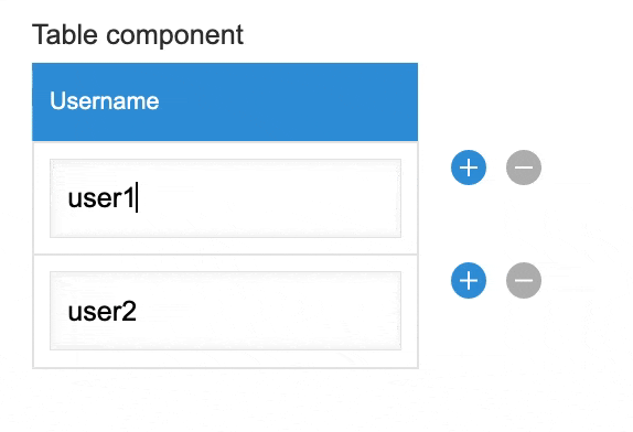
When you edit the input in the first cell, the Text component will trigger change event with detail.value = 'user1 edited'.
The table then catches that value and assigns it back to the username field.
Now the data of the table will be:
[{ username: 'user1 edited' }, { username: 'user2' }];
Modify the event detail
If you want to customize the value that the table receives, you need to modify it in the change event before the table receives it.
We also use the sample code above and add the following content to the renderName function:
...
const renderName = cellData => {
  const text = new Text({ value: cellData });

  // Modify the value before it bubble to table cell
  text.addEventListener('change', event => {
    event.detail.value = 'modified value'; // add any value you want set to username;
  });
  return text;
};
...
When you edit the input in the first cell, the value received by the table will always be 'modified value'.
Examples
Basic Usage
ReadOnlyTable
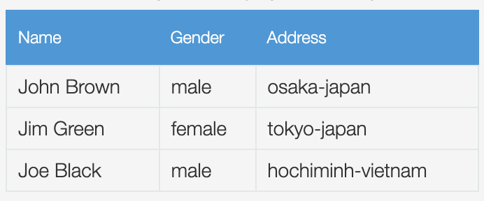
Display a read-only mode table.
Show code
const columns = [
  {
    title: 'Name',
    field: 'name'
  },
  {
    title: 'Gender',
    field: 'gender'
  },
  {
    title: 'Address',
    field: 'address'
  }
];

const data = [
  {
    name: 'John Brown',
    gender: 'male',
    address: 'osaka-japan'
  },
  {
    name: 'Jim Green',
    gender: 'female',
    address: 'tokyo-japan'
  },
  {
    name: 'Joe Black',
    gender: 'male',
    address: 'hochiminh-vietnam'
  }
];

const readOnlyTable = new Kuc.ReadOnlyTable({ columns, data });
const space = kintone.app.record.getSpaceElement('space');
space.appendChild(readOnlyTable);
Table
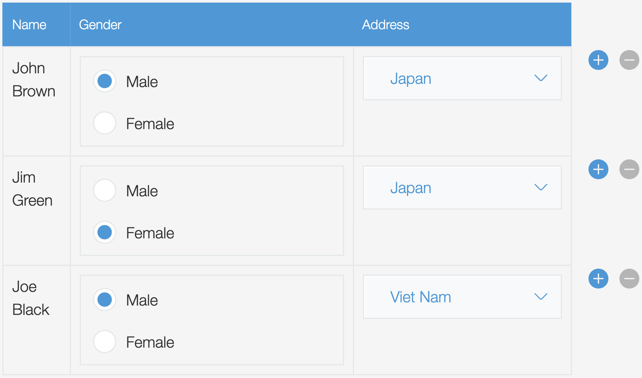
Display a table that can manipulate the components displayed in it.
Use the columns.render function to specify the component to be displayed in the cell. Please check the renderGender and the renderAddress functions in the following code example:
Show code
// render gender column with dropdown
const renderGender = cellData => {
  const radioButton = new Kuc.RadioButton({
    items: [
      {
        label: 'Male',
        value: 'male'
      },
      {
        label: 'Female',
        value: 'female'
      }
    ],
    itemLayout: 'vertical',
    value: cellData
  });

  return radioButton;
};

// render address column with dropdown
const renderAddress = cellData => {
  const country = cellData.split('-')[1];
  const dropdownCountry = new Kuc.Dropdown({
    items: [
      {
        label: 'Viet Nam',
        value: 'vietnam'
      },
      {
        label: 'Japan',
        value: 'japan'
      }
    ],
    value: country
  });

  return dropdownCountry;
};

const columns = [
  {
    title: 'Name',
    field: 'name'
  },
  {
    title: 'Gender',
    field: 'gender',
    render: renderGender
  },
  {
    title: 'Address',
    field: 'address',
    render: renderAddress
  }
];

const data = [
  {
    name: 'John Brown',
    gender: 'male',
    address: 'osaka-japan'
  },
  {
    name: 'Jim Green',
    gender: 'female',
    address: 'tokyo-japan'
  },
  {
    name: 'Joe Black',
    gender: 'male',
    address: 'hochiminh-vietnam'
  }
];

const table = new Kuc.Table({ columns, data });
const space = kintone.app.record.getSpaceElement('space');
space.appendChild(table);
Multiple components in one cell (Table)
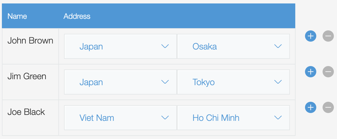
Put multiple components in one table cell using the columns.render function.
You can display two dropdowns (city and country) in the same cell.
Show code
const renderAddress = (cellData, rowData) => {
  // the format of cellData: 'city-country'
  const city = cellData.split('-')[0];
  const country = cellData.split('-')[1];

  const dropdownCity = new Kuc.Dropdown({
    items: [
      {
        label: 'Tokyo',
        value: 'tokyo'
      },
      {
        label: 'Osaka',
        value: 'osaka'
      },
      {
        label: 'Ho Chi Minh',
        value: 'hochiminh'
      }
    ],
    value: city
  });
  dropdownCity.addEventListener('change', event => {
    const _country = rowData.address.split('-')[1];
    event.detail.value = `${event.detail.value}-${_country}`;
  });

  const dropdownCountry = new Kuc.Dropdown({
    items: [
      {
        label: 'Viet Nam',
        value: 'vietnam'
      },
      {
        label: 'Japan',
        value: 'japan'
      }
    ],
    value: country
  });
  dropdownCountry.addEventListener('change', event => {
    const _city = rowData.address.split('-')[0];
    event.detail.value = `${_city}-${event.detail.value}`;
  });

  const container = document.createElement('div');
  container.style.display = 'flex';
  container.appendChild(dropdownCountry);
  container.appendChild(dropdownCity);

  return container;
};

const data = [
  {
    name: 'John Brown',
    gender: 'male',
    address: 'osaka-japan'
  },
  {
    name: 'Jim Green',
    gender: 'female',
    address: 'tokyo-japan'
  },
  {
    name: 'Joe Black',
    gender: 'male',
    address: 'hochiminh-vietnam'
  }
];

const columns = [
  {
    title: 'Name',
    field: 'name'
  },
  {
    title: 'Address',
    field: 'address',
    render: renderAddress
  }
];

const table = new Kuc.Table({ columns, data });
const space = kintone.app.record.getSpaceElement('space');
space.appendChild(table);
Dependent columns (Table)
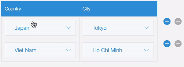
Develop the dependent columns.
The city dropdown will be updated when the country dropdown is changed.
Show code
// Each country will have corresponding cities
const relatedData = {
  japan: [
    { label: 'Tokyo', value: 'tokyo' },
    { label: 'Osaka', value: 'osaka' }
  ],
  vietnam: [
    { label: 'Ha Noi', value: 'hanoi' },
    { label: 'Ho Chi Minh', value: 'hochiminh' }
  ]
};

const renderCity = (cellData, rowData) => {
  const dropdownCity = new Kuc.Dropdown({
    items: [
      {
        label: 'Tokyo',
        value: 'tokyo'
      },
      {
        label: 'Ho Chi Minh',
        value: 'hochiminh'
      }
    ],
    value: cellData
  });

  // Logic update city when country column changed
  lastRenderedCountryComponent.addEventListener('change', event => {
    dropdownCity.items = relatedData[event.detail.value];
    rowData.city = '';
  });

  return dropdownCity;
};

let lastRenderedCountryComponent;
const renderCountry = cellData => {
  const dropdownCountry = new Kuc.Dropdown({
    items: [
      {
        label: 'Viet Nam',
        value: 'vietnam'
      },
      {
        label: 'Japan',
        value: 'japan'
      }
    ],
    value: cellData
  });
  lastRenderedCountryComponent = dropdownCountry;
  return dropdownCountry;
};

const columns = [
  {
    title: 'Country',
    field: 'country',
    render: renderCountry
  },
  {
    title: 'City',
    field: 'city',
    render: renderCity
  }
];

const data = [
  {
    country: 'japan',
    city: 'tokyo'
  },
  {
    country: 'vietnam',
    city: 'hochiminh'
  }
];

const table = new Kuc.Table({ columns, data });
const space = kintone.app.record.getSpaceElement('space');
space.appendChild(table);
Nested tables (Table)
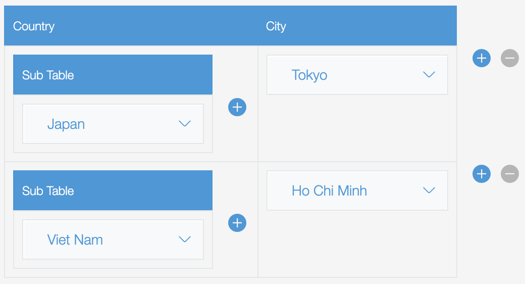
Show more detailed info on every row with nested tables.
Show code
const renderCity = cellData => {
  const dropdown = new Kuc.Dropdown({
    items: [
      { label: 'Tokyo', value: 'tokyo' },
      { label: 'Ho Chi Minh', value: 'hochiminh' }
    ],
    value: cellData
  });

  return dropdown;
};

const renderCountry = cellData => {
  const renderSubTable = cellDataSubTable => {
    const dropdown = new Kuc.Dropdown({
      items: [
        { label: 'Japan', value: 'japan' },
        { label: 'Viet Nam', value: 'vietnam' }
      ],
      value: cellDataSubTable
    });
    return dropdown;
  };

  const columnsSubTable = [
    {
      title: 'Sub Table',
      field: 'dropdown',
      render: renderSubTable
    }
  ];

  const dataSubTable = [];
  for (let i = 0; i < cellData.split(',').length; i++) {
    dataSubTable.push({ dropdown: cellData.split(',')[i] });
  }
  const subTable = new Kuc.Table({
    columns: columnsSubTable,
    data: dataSubTable
  });

  subTable.addEventListener('change', subTableEvent => {
    const _dataSubTable = subTableEvent.detail.data;
    let countries = '';
    for (let i = 0; i < _dataSubTable.length; i++) {
      countries += _dataSubTable[i].dropdown;
      if (i !== _dataSubTable.length - 1) {
        countries += ',';
      }
    }
    subTableEvent.detail.value = countries;
  });
  return subTable;
};

const columns = [
  {
    title: 'Country',
    field: 'country',
    render: renderCountry
  },
  {
    title: 'City',
    field: 'city',
    render: renderCity
  }
];

const data = [
  {
    city: 'tokyo',
    country: 'japan'
  },
  {
    city: 'hochiminh',
    country: 'vietnam'
  }
];

const table = new Kuc.Table({ columns, data });
const space = kintone.app.record.getSpaceElement('space');
space.appendChild(table);
This article was reviewed by Kintone and Google Chrome as of February 2023.
In addition, the version of Kintone UI Component that is used for customizations is v1.9.0.