In-office day list customization
Overview
This article explains how to utilize and customize the FieldGroup and Tooltip components in the context of creating an In-Office Day List.
In this context, a Table component within the FieldGroup allows team members to specify which days they will be in the office.
We assume the following scenario:
- Basic Usage for FieldGroup and Tooltip
- Append Table component to FieldGroup content
- Using Two Types of Tooltip
Components to use
What you will need to have ready
Create an app that includes a blank space field with the id "space".
JavaScript and CSS Customization
When you import the UMD file of Kintone UI Component to the app, you can upload the JavaScript files by following these steps:
You can see how to upload a file in the Quick Start.
Basic Usage for FieldGroup and Tooltip
Create Tooltip with Basic FieldGroup
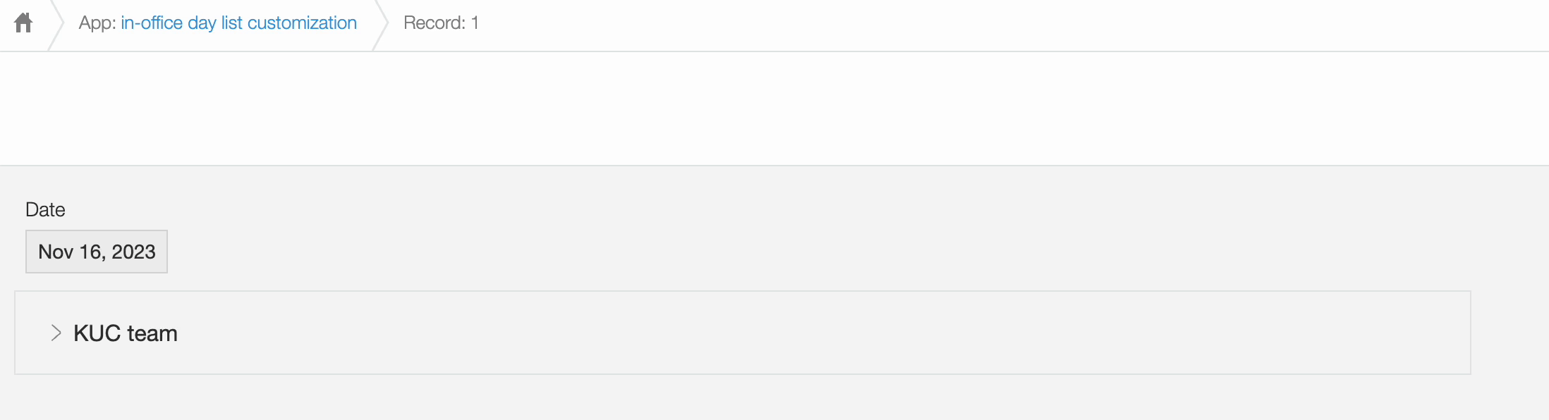
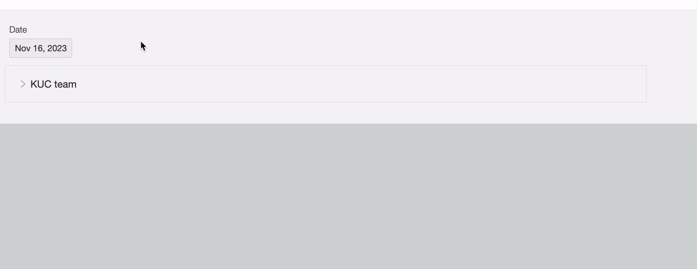
Create a Basic FieldGroup with a label "KUC team" and the Text component as its content.
  const kucTeamFieldGroup = new Kuc.FieldGroup({
    label: 'KUC team',
    content: new Kuc.Text({text: 'This is a FieldGroup'})
  });
Create a Tooltip component with the tooltip message "Office day info" for the FieldGroup and associated them.
  const kucTeamTooltip = new Kuc.Tooltip({
    title: 'Office day info',
    content: kucTeamFieldGroup
  });
The display on UI
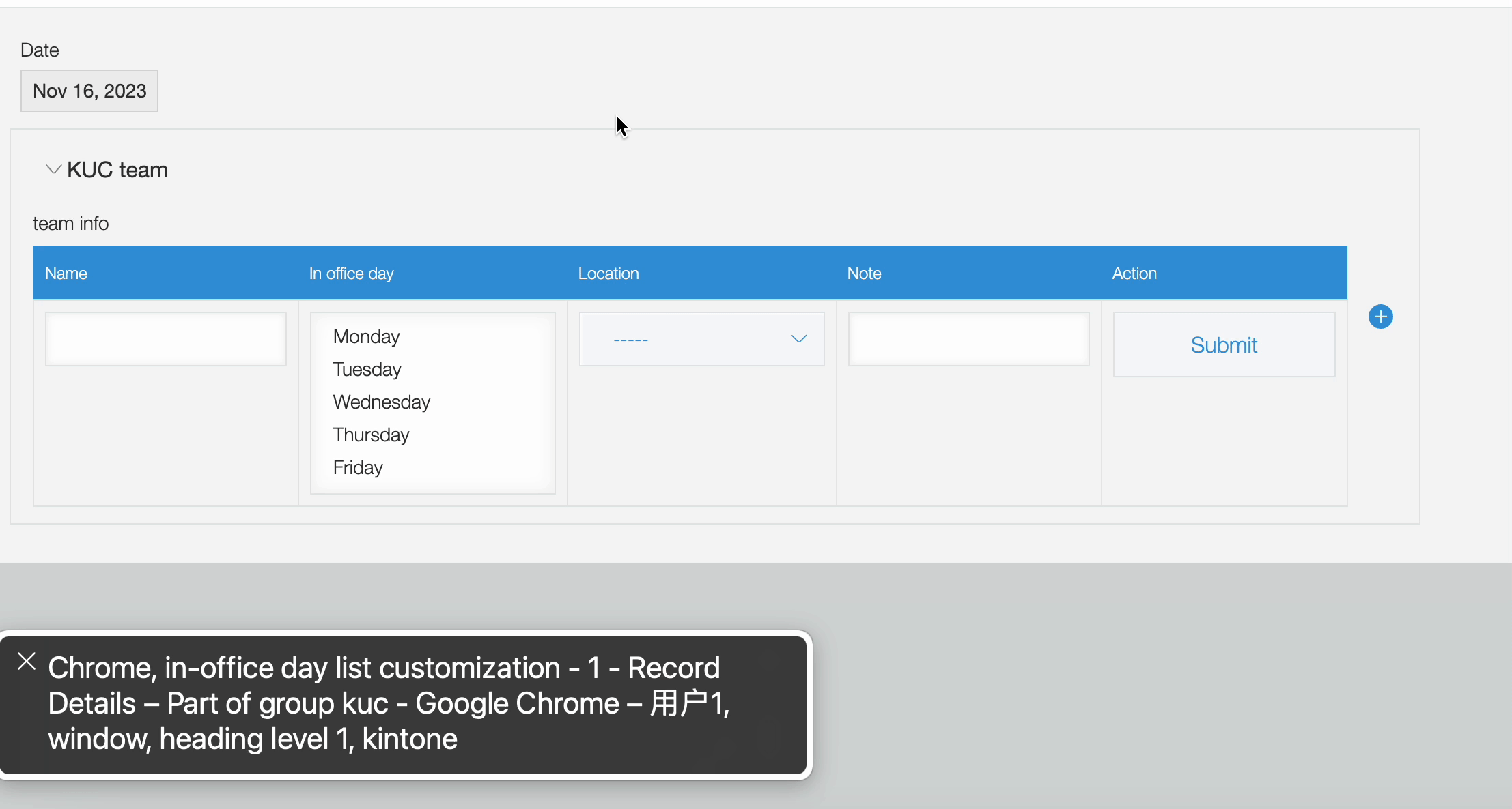
Append Table components to FieldGroup content
In the default Kintone, FieldGroup can't have a table, but KUC allows FieldGroup to show a table when it's open.
Create Tooltip with HTML Button
Begin by creating a Tooltip component associated with an HTML button, conveying the message "Submit changes or additions for this entry."
  const button = document.createElement('button');
  button.textContent = 'Submit';

  const tooltipForButton = new Kuc.Tooltip({
    title: 'Submit changes or additions for this entry.',
    container: button,
    describeChild: true,
    placement: 'bottom'
  });
Create Table with Dropdown, Text, MultiChoice components and Button wrapped by Tooltip
Create a Table component containing information such as "Name", "In office day", "Location" and "Note" and a button wrapped in a Tooltip.
  const renderName = cellData => {
    const input = document.createElement('input');
      input.type = 'text';
      input.value = cellData;
      input.style.cssText = `
        border: 1px solid #e3e7e8;
        color: #333333;
        font-size: 14px;
        white-space: nowrap;
        height: 40px;
        padding: 0 8px;
        width: 177px;
        box-sizing: border-box;
        box-shadow: 2px 2px 4px #f5f5f5 inset, -2px -2px 4px #f5f5f5 inset;
      `;
      input.addEventListener('focus', () => {
        input.style.border = '1px solid #3498db';
      });
      input.addEventListener('blur', () => {
        input.style.border = '1px solid #e3e7e8';
      });
      return input;
  };

  const renderDay = cellData => {
    return new Kuc.MultiChoice({
      items: [
        {
          label: 'Monday',
          value: '1'
        },
        {
          label: 'Tuesday',
          value: '2'
        },
        {
          label: 'Wednesday',
          value: '3'
        },
        {
          label: 'Thursday',
          value: '4'
        },
        {
          label: 'Friday',
          value: '5'
        }
      ],
      value: cellData
    });
  };

  const renderLocation = cellData => {
    return new Kuc.Dropdown({
      items: [
        {
          label: '-----',
          value: '-'
        },
        {
          label: 'Tokyo',
          value: 'Tokyo'
        },
        {
          label: 'Vietnam',
          value: 'Vietnam'
        },
        {
          label: 'Shanghai',
          value: 'Shanghai'
        }
      ],
      value: cellData
    });
  };

  const renderNote = cellData => {
    return new Kuc.Text({
      value: cellData
    });
  };

  const renderAction = cellData => {
      const button = document.createElement('button');
      const tooltipForButton = new Kuc.Tooltip({
        title: 'Submit changes or additions for this entry.',
        container: button,
        describeChild: true,
        placement: 'bottom'
      });
      return tooltipForButton;
    };

  const kucTeamTable = new Kuc.Table({
    label: 'team info',
    columns: [
      {
        title: 'Name',
        field: 'name',
        render: renderName
      },
      {
        title: 'In office day',
        field: 'day',
        render: renderDay
      },
      {
        title: 'Location',
        field: 'location',
        render: renderLocation
      },
      {
        title: 'Note',
        field: 'note',
        render: renderNote
      },
      {
        title: 'Action',
        field: 'action',
        render: renderAction}
    ],
    data: [
      {
        name: '',
        day: [],
        location: '-',
        note: ''
      }
    ]
  });
Create FieldGroup with Table component
Create a FieldGroup component with the label "KUC team" and the Table component as its content.
  const kucTeamFieldGroup = new Kuc.FieldGroup({
    label: 'KUC team',
    content: kucTeamTable
  });
Create Tooltip with the FieldGroup
Create Tooltip for the FieldGroup and associated them.
  const kucTeamTooltip = new Kuc.Tooltip({
    title: 'Office day info',
    container: kucTeamFieldGroup,
  });
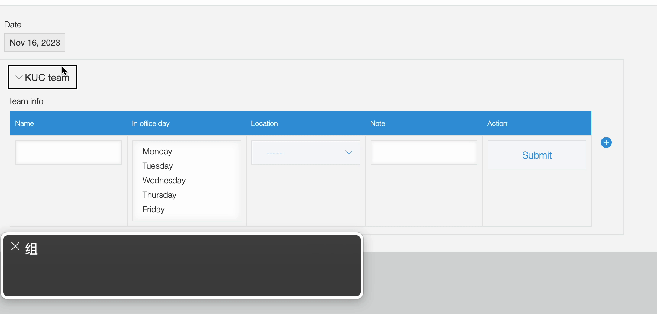
Add Event listener for FieldGroup
Add event listener for FieldGroup to change the tooltip message when FieldGroup is expanded or collapsed
   kucTeamFieldGroup.addEventListener('change', e => {
    if (e.detail.expanded) {
      kucTeamFieldGroup.title = '';
    } else {
      kucTeamFieldGroup.title = 'Office day info';
    }
  });
The display on UI
Using Two Types of Tooltip
You may have noticed that when creating a Tooltip for a button, I will introduce a new property describeChild.
This property is set to false by default.
You can effectively improve the accessibility and usability of your application with the describeChild property.
Now, let's enable the screen reader and try moving the focus to see what the screen reader reads.
Tooltip represents the description of the element
If the Tooltip represents the description of the element (provides additional information or a supplementary description about the element it is attached to), you need to set describeChild to true.
  const tooltipForButton = new Kuc.Tooltip({
    title: 'Submit changes or additions for this entry.',
    container: button,
    describeChild: true,
    placement: 'bottom'
  });
In the examples, we can see that when describeChild is set to true, the screen reader first reads the content of the button itself "Submit" when the button gains focus, then continues to read the Tooltip's title "Submit changes or additions for this entry.".
This is because when describeChild is true, Tooltip adds aria-describedby to its child elements (button), causing the screen reader to read the original content first and then continue with the content of aria-describedby.
Tooltip represents the purpose of the element
If the Tooltip represents the purpose of the element itself (provides a label for the element it is attached to), you need to set describeChild to false.
Let's take a look at the example below.
In the example, we set the Input tag in the Name field of the table, but the Input tag cannot read the word "Name" in the screen reader, so we can use Tooltip to solve this problem.
We create a Tooltip for the Input component, set the title of the Tooltip to "Name", and set describeChild to false to see what the screen reader reads.
const renderName = cellData => {
  const input = document.createElement('input');
  ...
  const tooltipForInput = new Kuc.Tooltip({
    title: 'Name',
    container: input,
    describeChild: false,
    placement: 'bottom'
  });
  return tooltipForInput;
};
This time, we can see that when describeChild is set to false, the screen reader reads the content of the Tooltip's title "Name" when the input gains focus.
This is because when describeChild is false, Tooltip adds aria-label to its child elements (input, fieldGroup), causing the screen reader to read the content of aria-label.
This article was reviewed by Kintone and Google Chrome as of Feb, 2024.
In addition, the version of Kintone UI Component that is used for customizations is v1.16.0.